
TatStat
TatStat is a client-friendly scheduling mobile app by tattoo artists for tattoo artists.

My role: UI Design, UX Design
Deliverables: User Surveys, Competitive Analysis, User Flow, User Personas, Site Map, Wireframes, Usability Testing, High Fidelity Mockups
Tools Used: Figma
Timeline: October 2020 - February 2021
Summary
I was reached out to by Bitwise Industries who was looking for a UX Designer for a client of theirs. Their client was TatStat, a tattoo booking mobile app, that needed help when it came to the booking and scheduling portions of the app.
Customer Research
To understand more about the percentage of people in America with tattoos, I looked to Ispos to read up on a study that was conducted specifically when it came to Americans with tattoos. In a sample of 1005 adults:
· 30% of Americans have at least one tattoo.
· 40% of those who are tattooed are between the ages 18-34, while 36% of them are 35-54.
· 46% have had at least one tattoo for more than 10 years.
Competitive Analysis
I performed a competitive analysis to determine whether or not there were other apps out there that were doing the same thing we wanted to do. I discovered only one, Tattoodo. After downloading their app, I went through their onboarding process to get a clear idea of how easy it would be, as well as any potential pain points. I also took a few screenshots to bring to my clients in order to show them what Tattoodo was doing well and how we should streamline our onboarding process.


After a SWOT analysis, I was able to determine some opportunities for my product:
Improve the onboarding experience by introducing how to explore the app and how to get around the home screen for first time users.
Provide information about the tattoo artist and tattoo styles they do.
Easily keep track of certain styles the user would like to get tattooed.
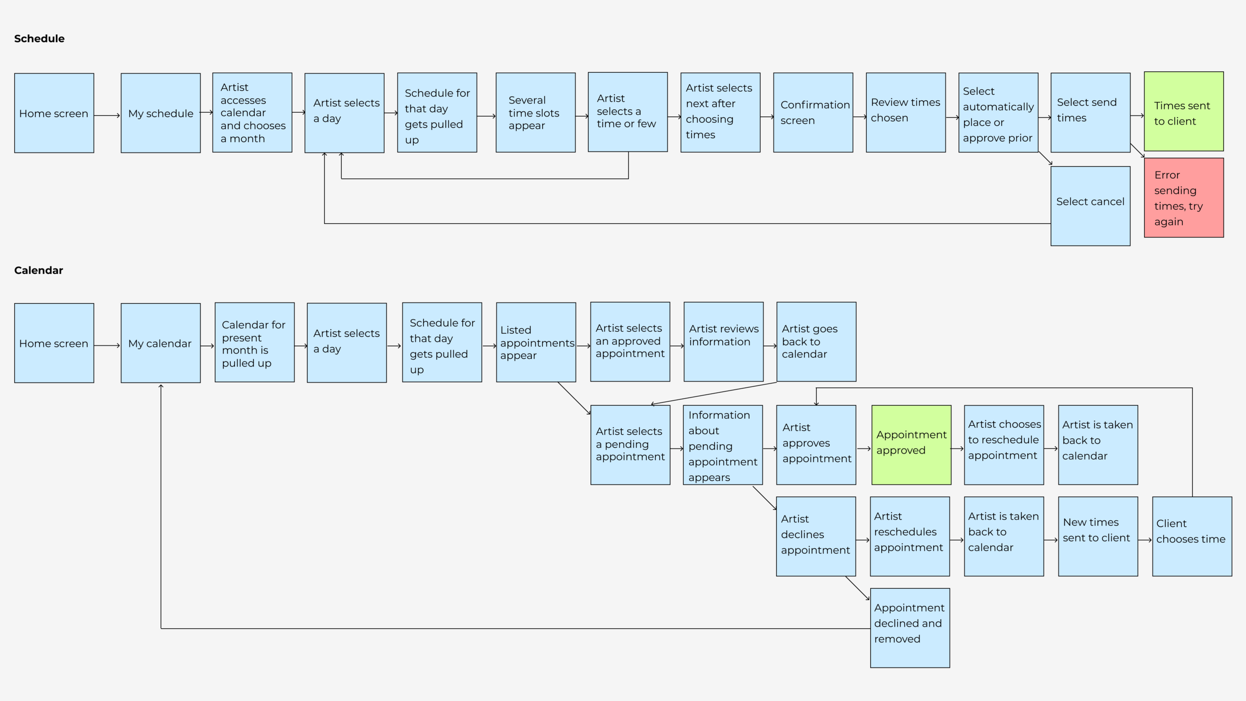
User Flow
LoFi Wireframes
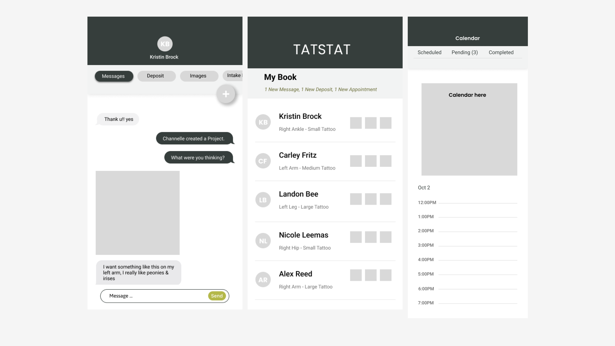
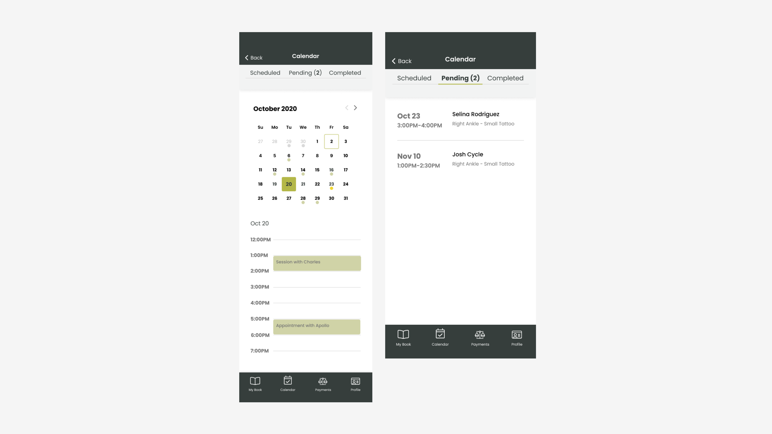
Hi-fi screens


User Testing and Revisions
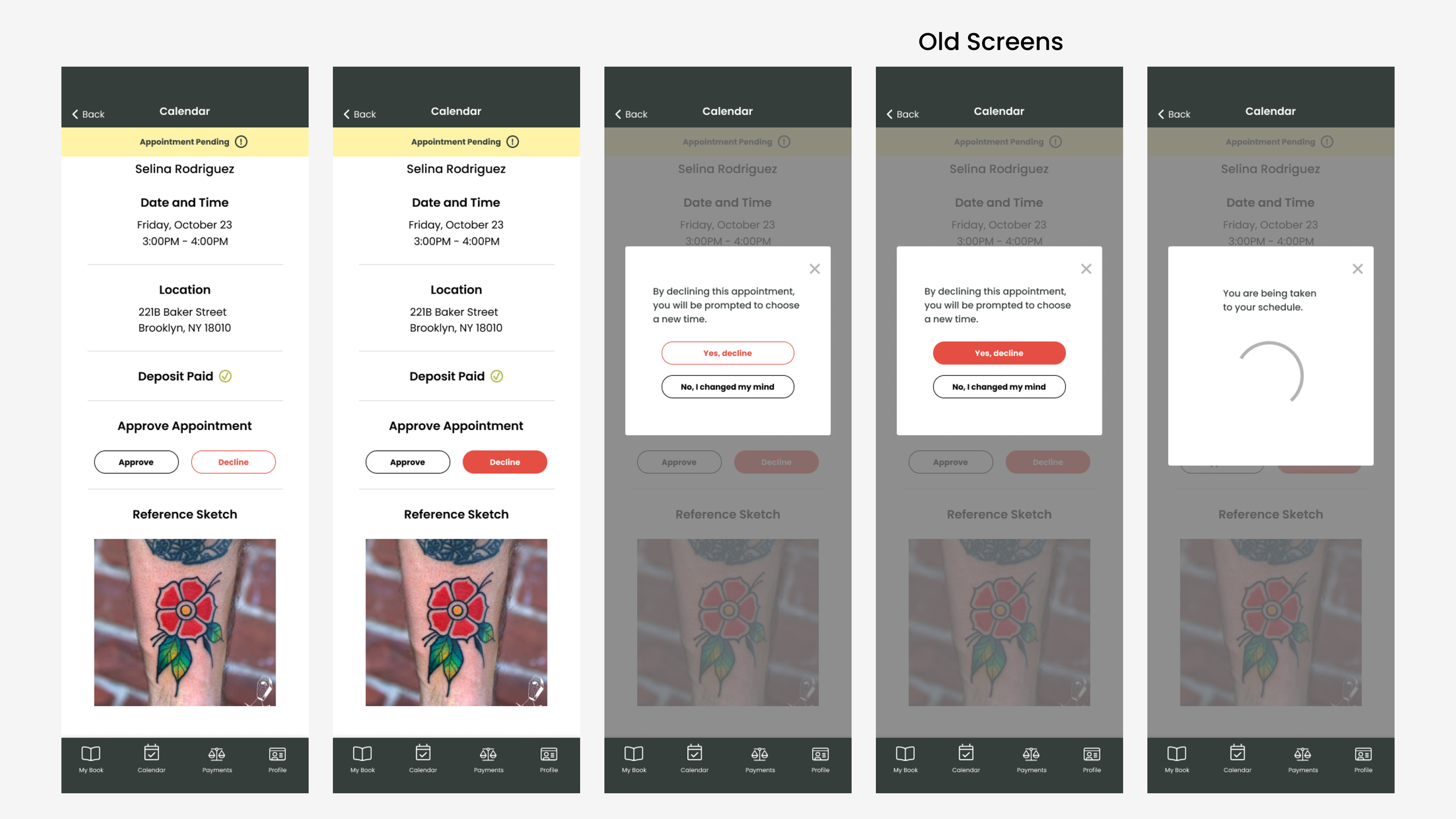
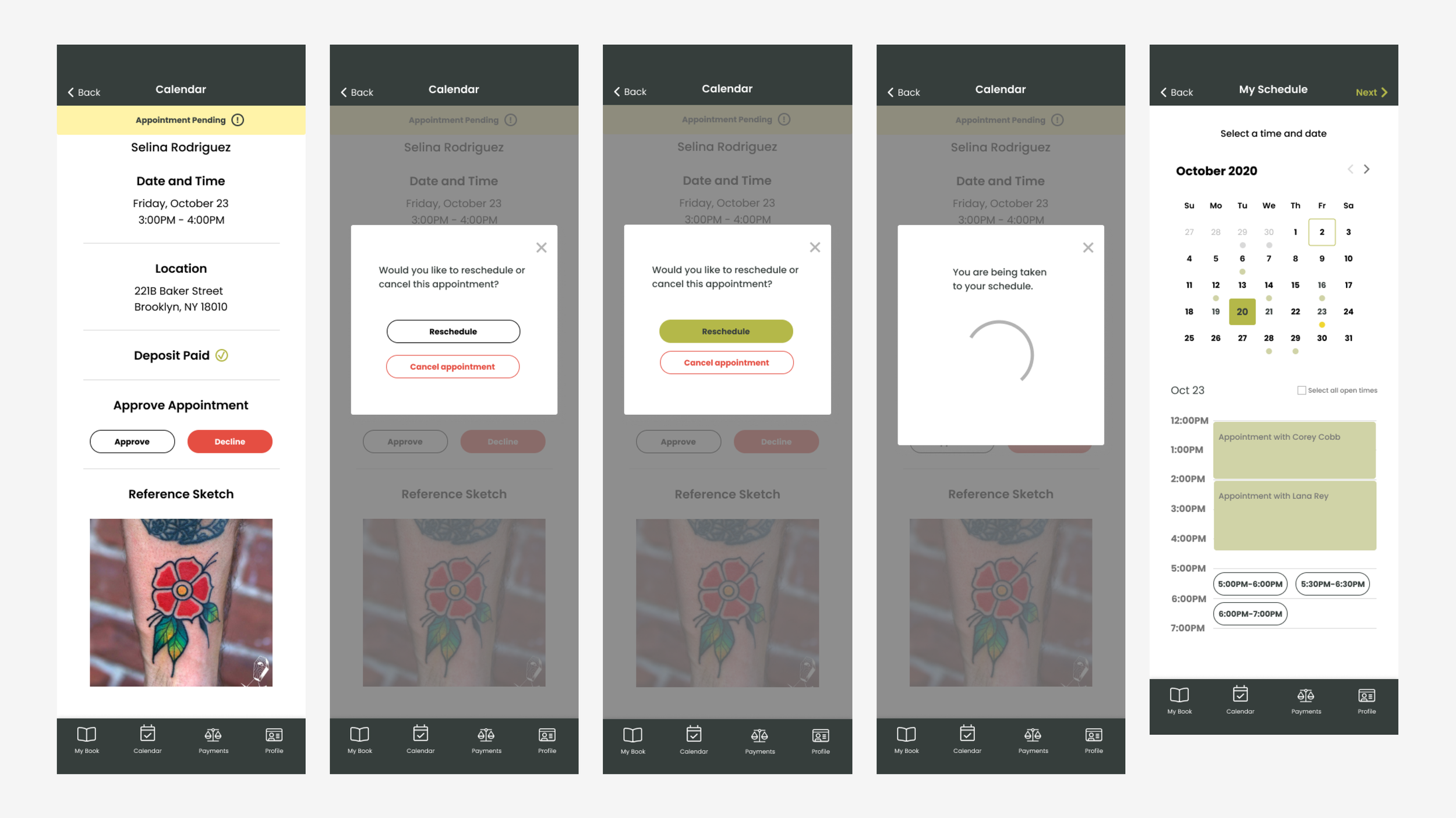
After conducting user testing of our prototype via UserTesting.com, a user pointed out that rather than just being able to decline an appointment after landing on the appointment pending screen for the client, they would prefer being able to reschedule the appointment, rather than having the appointment disappear completely. I thought this was a great point, and updated the user flow to include when the artist declines an appointment, they have the option to either reschedule the appointment or cancel the appointment entirely. Depending on what they choose, the appointment either gets canceled and that’s where the flow stops, OR, they can reschedule the appointment by getting taken back to their calendar.
Old Screens
New Screens
Conclusion
This project was definitely something new for me, especially designing calendars. I think that while it was complex, I do enjoy complex things so being able to map things out and design some user flows was helpful. If I had more time, I definitely would love to create a design system for this. The brand and styling was already chosen before I was brought on to the project, and I do wish I was able to work on it because they had the primary brand colors set, but not secondary colors. It definitely helps to have a bit of variety or accents colors to polish everything. It would also be helpful in terms of accessibility (color contrast) because their “main color” was their brand green, which is somewhat light, and they often use white to pair with it (but it doesn’t pass the accessibility guidelines!!). I also wish there was a versatile typeface for all these different headers, paragraphs, and buttons. All in all, I definitely would love to have had time to polish things up for the second version.