
Poppu
A platform for listening to City Pop, a sub-genre of Japanese pop music. The application is meant to be simple yet bold, a throwback to the 80’s era when City Pop started.

My role: UI Design, UX Design, Branding and Identity
Deliverables: User Surveys, Competitive Analysis, User Stories, User Flow, User Personas, Site Map, Wireframes, Usability Testing, High Fidelity Mockups
Tools Used: Figma, Photoshop, Adobe XD
Timeline: April 2019 - May 2019
Collaborators: Shelley Liang - Designer; led the user interviews and testing, as well as style guides, branding, and interface design.
Type of project: Personal Project
Problem
Have you ever listened to a great song on YouTube, only to find out that the song isn’t on Spotify? Tons of Japanese songs aren’t available on the Spotify app, or if they are, it’s not on the Western market. City Pop is making a big comeback. Songs such as the famous, Plastic Heart, can’t be found on Spotify, only YouTube where the sound quality is sub-par, or copyright will eventually take the video down. So, what’s an avid City Popper to do?
Solution
Poppu provides users with an alternative platform for listening to City Pop songs. The simple interface allows for users to discover City Pop artists and songs. The platform also allows for emerging artists to upload their songs.
User Research
I conducted user interviews via surveys to learn more about their experiences with other music platforms, namely Spotify and Tidal. I wanted to identify their needs and wants, as well as pain points with the platforms. The demographics for both Spotify and Tidals were namely 20-25 year old individuals, the same demographics for Poppu.
Sample of User Survey Questions


Competitive Analysis
I performed a competitive analysis to see how to differentiate Poppu, and understand the music sector.
After a SWOT analysis, I was able to determine some opportunities for my product:
Create a music platform for young and emerging artists who want to remix music.
Provide a minimalistic, but bold vibe to the interface.
Recommend similar songs to users by using suggestions from their playlists.
User Stories

User Flow

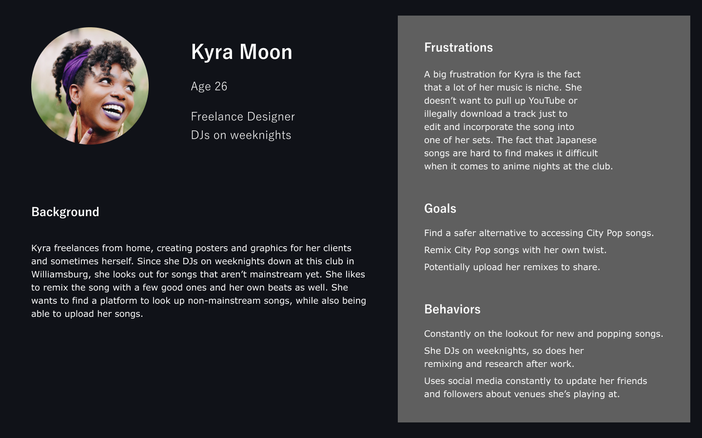
User Personas

Site Map

Wireframe Sketches


Wireframes in Figma


UI Design
I first started out by sketching out some wireframes of possible ways the platform could look, then sent them to users who would give their thoughts and opinions on the layout. Afterwards, I started coming up with color schemes to determine which one would incorporate the 80's feeling into it.
After creating the border and logo, I was stuck on what options to give, but in the end I wanted it to be as simple as possible, so I gave four. Originally, the playlists were going to be set as a list like on Spotify, but when I sent out the designs to users again, they said it reminded them too much of Spotify.
So, I changed the playlists into a grid option; this was better than the list because City Pop is very bold and visual, so I incorporated that same boldness in the pictures.
I wanted it to be different from Spotify by putting down three options when a song is playing, which are to read the lyrics (both in Japanese and English), radio, and shuffle the songs. For the font, I chose this one specifically because it was a font I had usually seen in East Asian music videos (80's - 90's), but also in karaoke places; I really wanted there to be an authentic 80's feeling to it. All in all, I wanted there to be the bright and boldness of the 80's, but the minimalistic trends of today.
Moodboard

Branding

Logo and Mind Mapping


Revisions
After doing more user testing and receiving user feedback, I iterated the designs.
Some of the feedback I received was:
“There’s no exploration in what the site is like for the artists who want to share their music.”
“Lyrics, Radio, and Shuffle don’t exactly belong in the same grouping, and should perhaps be separated and moved elsewhere.”
“The ‘+’ next to my Playlists is confusing because I’m not sure if that’s an indicator of expanding that section or to add to another playlist.”
Before & After


Final Mockups


Conclusion
This was really a fun project to work on, especially because I was able to use the neon aesthetic as an inspiration. It was fun trying to incorporate the vibrant vibes into this app, while still maintaining a clean visual.
I definitely would love to have more users test this out, and see if I can’t include more genres, maybe even anime songs onto the platform. I would also love to explore more with users uploading their own content.